Self Promotion Final ideas and Prep Work

For my self promotional idea i have decided i want to create a self promotional pack. Within this pack there will be an assortment of goodies and handy information about myself.I dont want to create any more work for myself so i will base my self promotion around my goddess final major project idea and use work that i have already done to create into a self promotional pack. With a strict 2 week turnaround and with me being in Paris for half of that time i think this is a wise move.

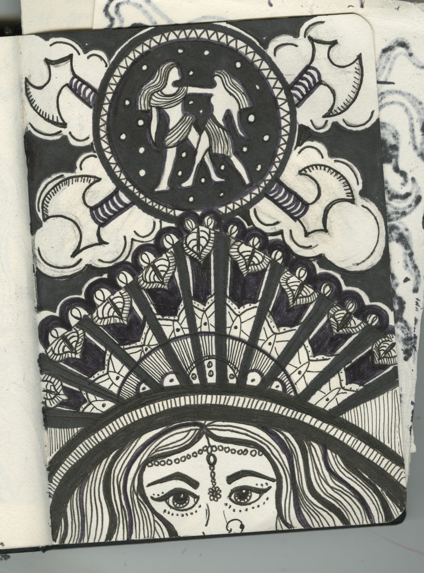
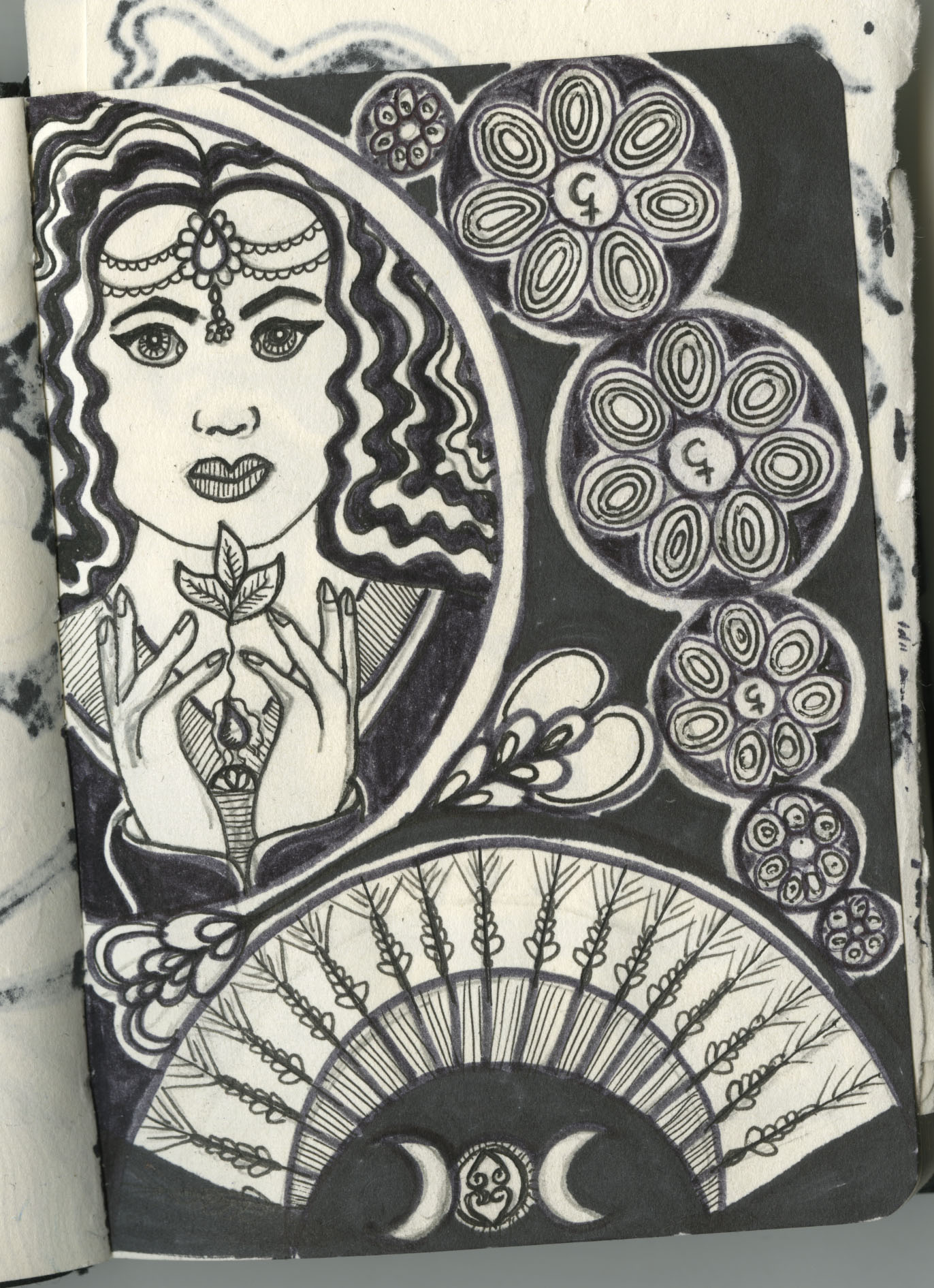
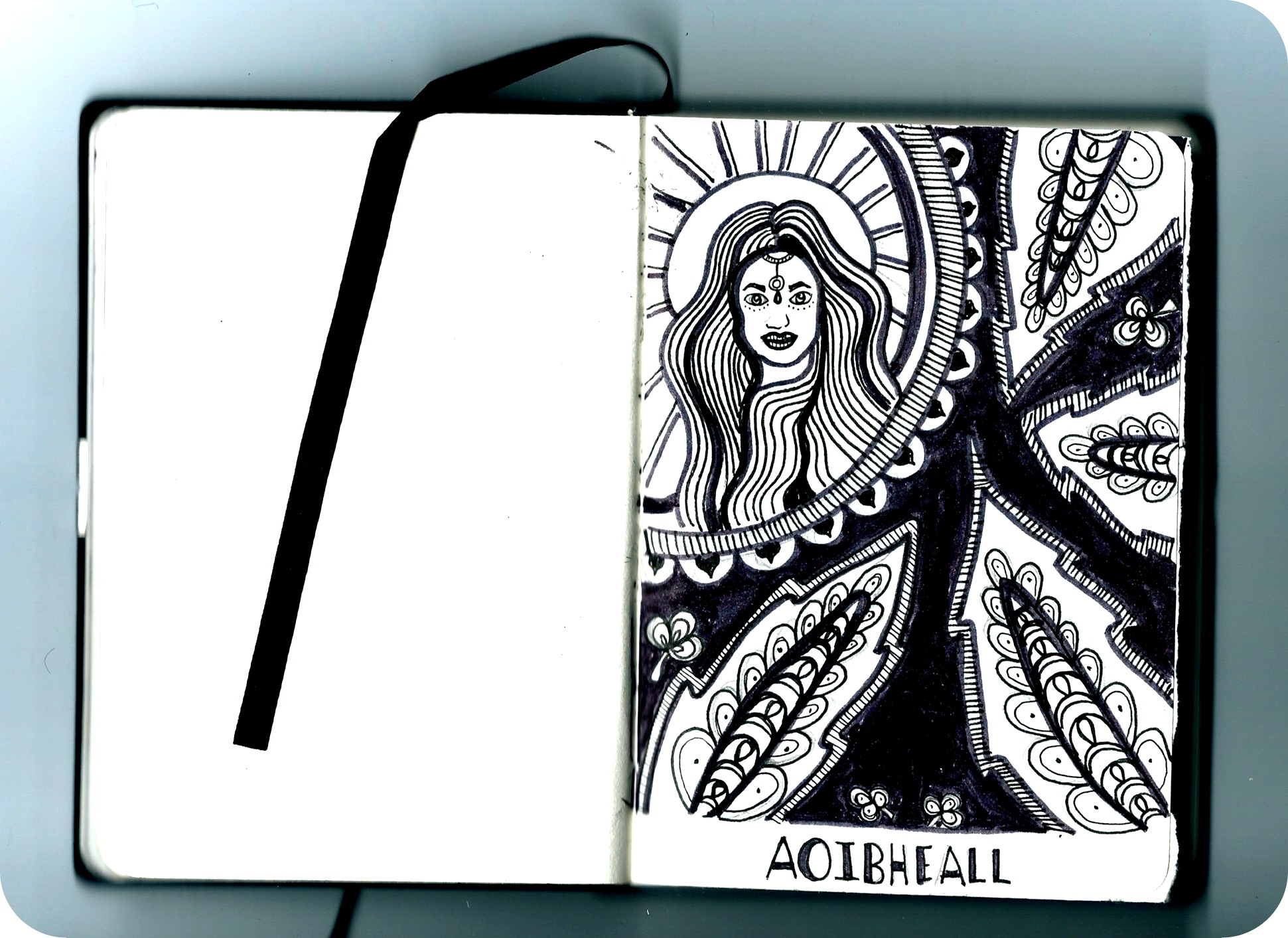
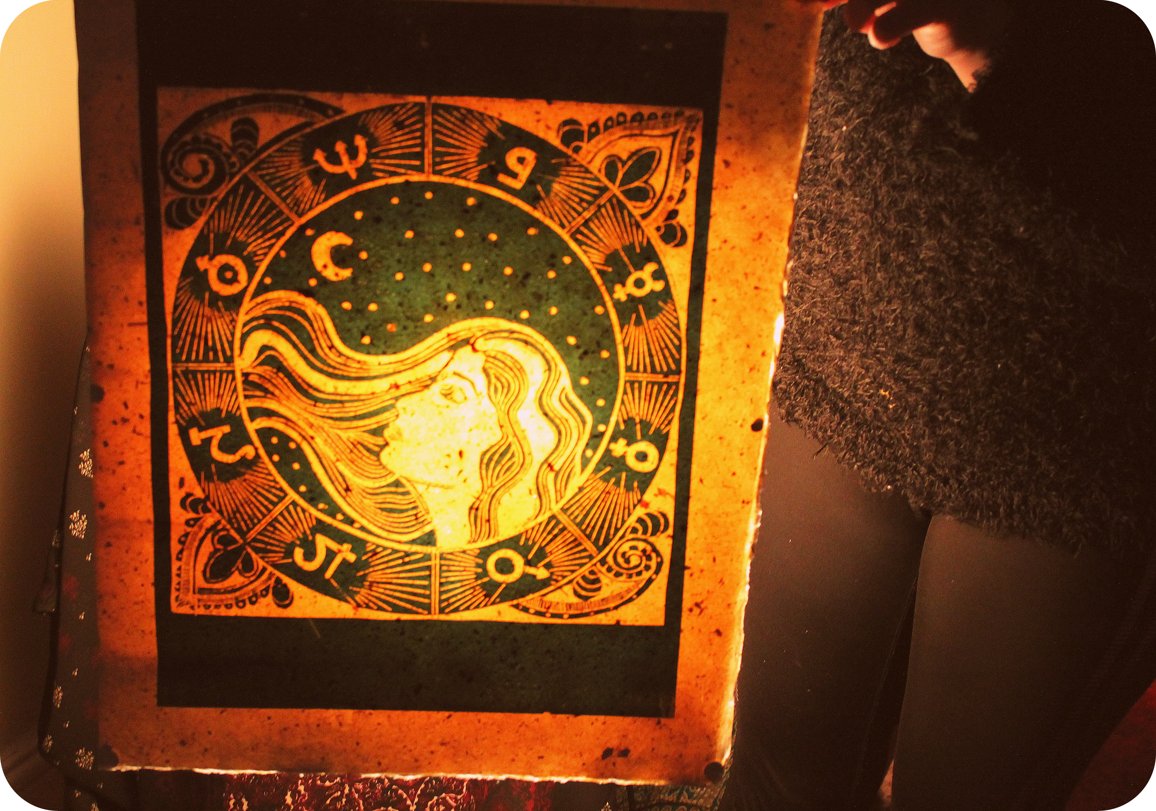
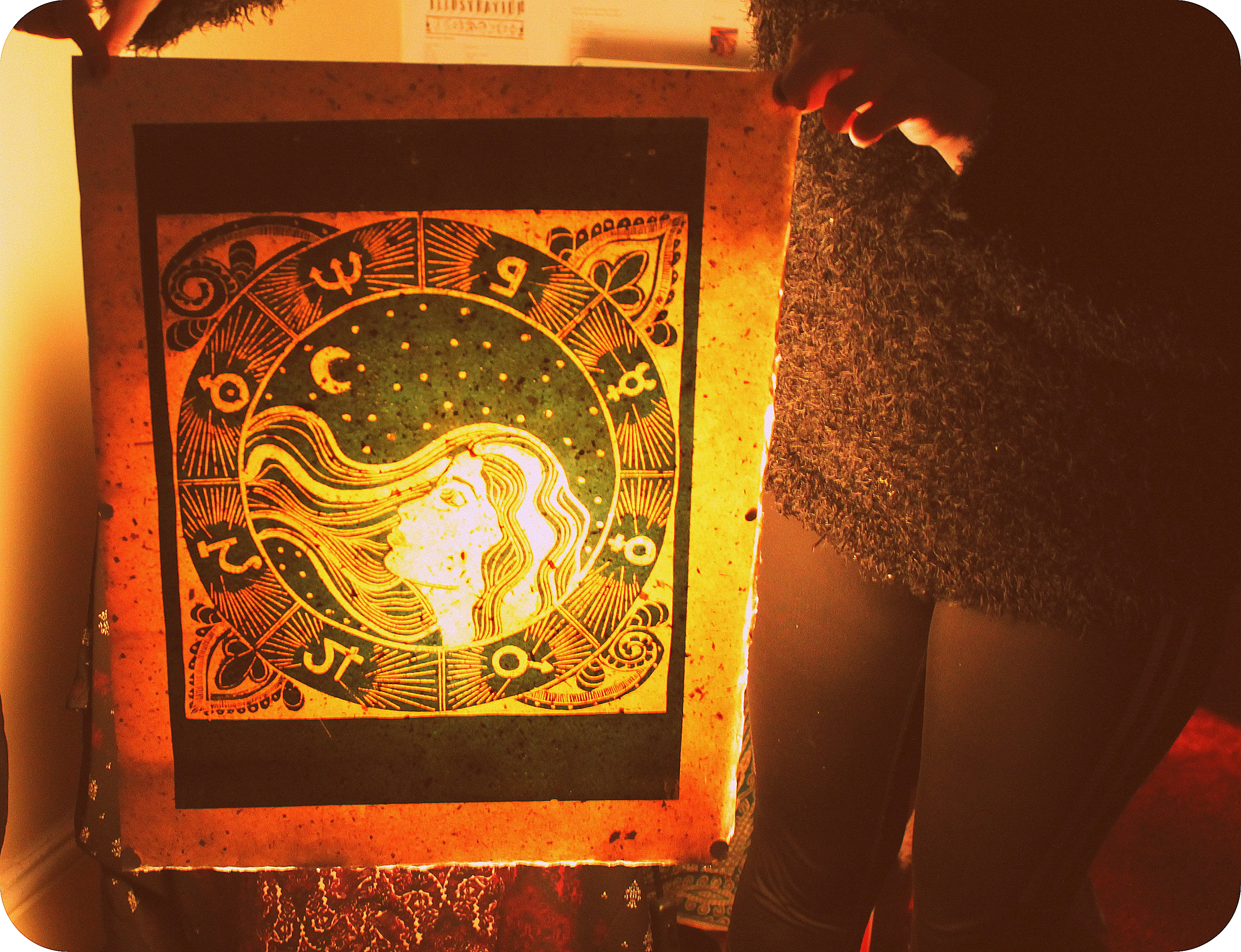
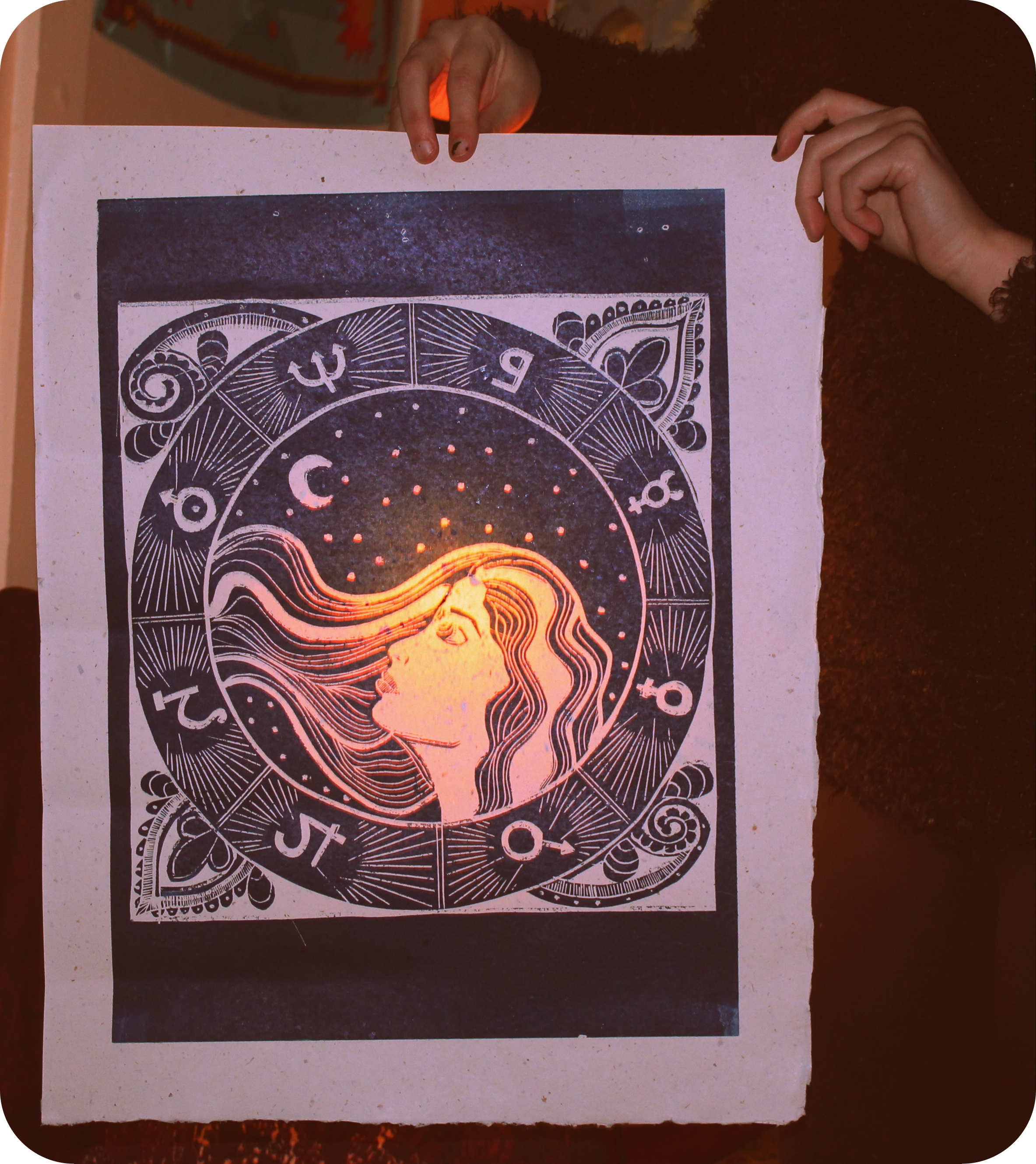
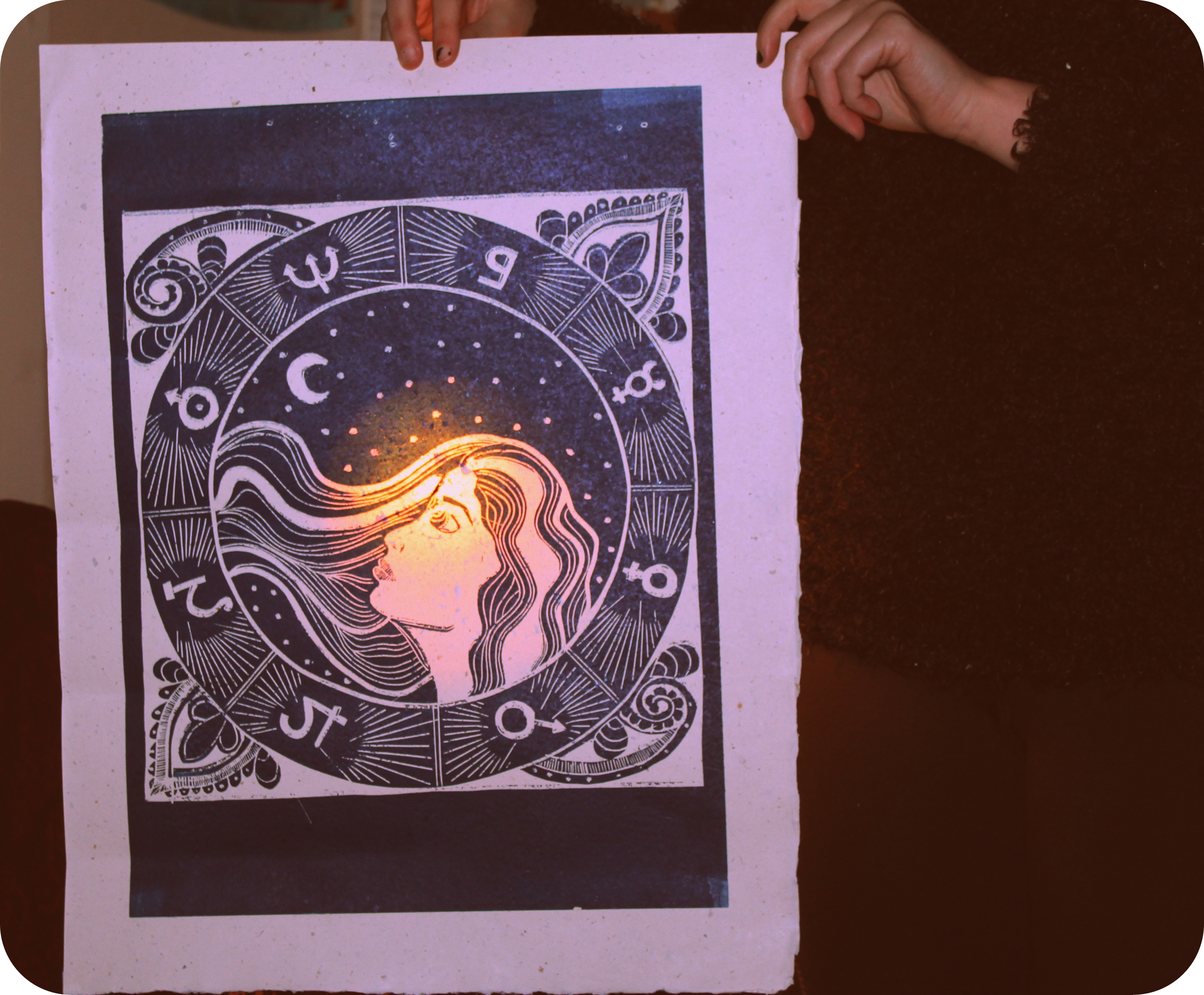
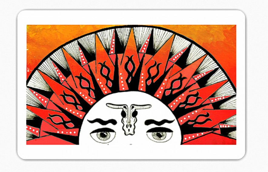
Firstly am creating a 4 page mini booklet using images from my A5 sketchbook with black and white images of goddesses with spot colour used and added in photoshop.

I am also creating a postcard to slip in the pack which will have my website details on where clients can look up more of my work.

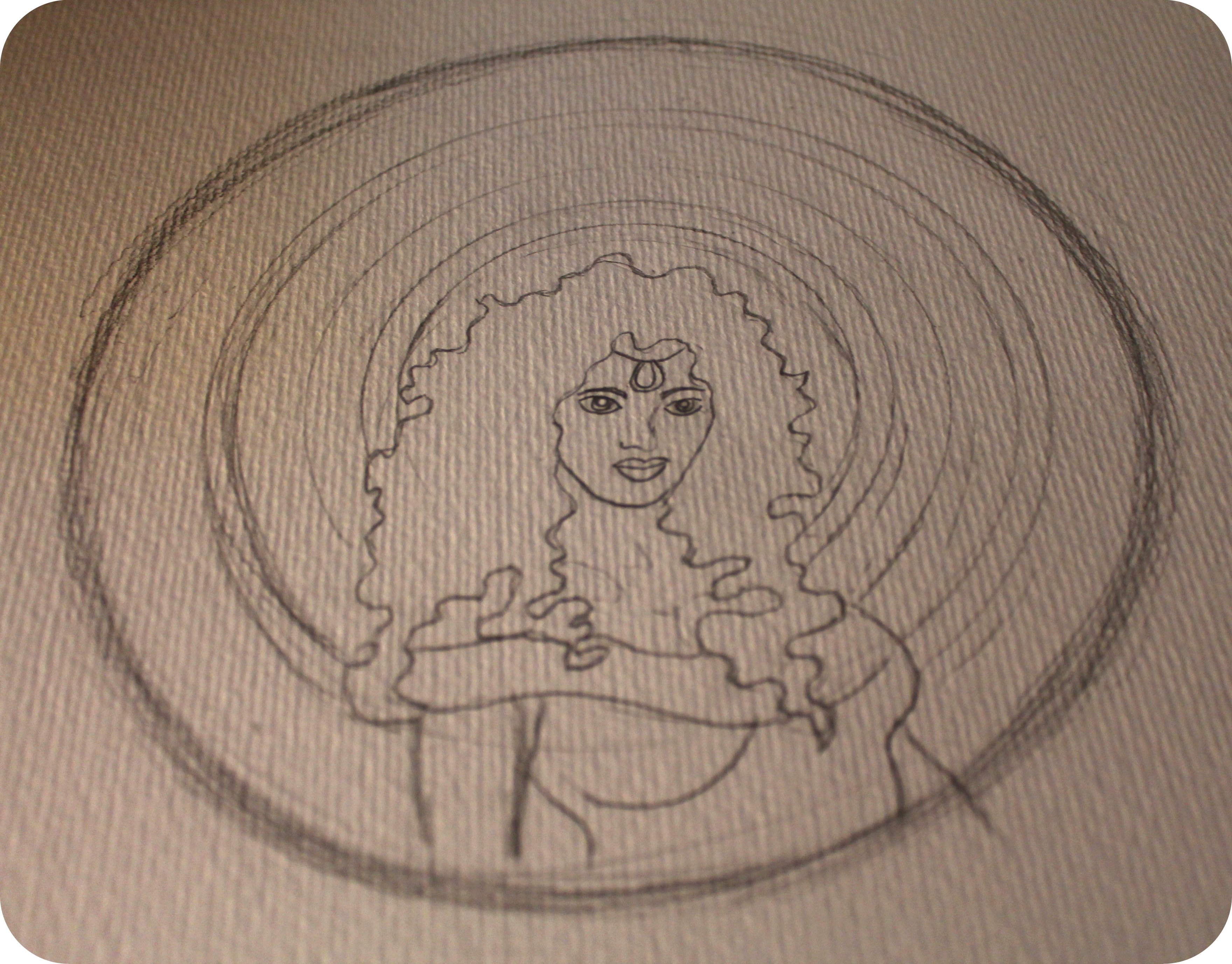
The unique part of my self promotion will be a laser cut A5 goddess image that will act as a piece of art itself. Doing this allows me to follow through with my final major project plans of testing out the laser cutter so i can kill two birds with one stone essentially. Again as time is of the essence i need to tie in self promotion with my final major project so i am not creating extra work and extra stress for myself.

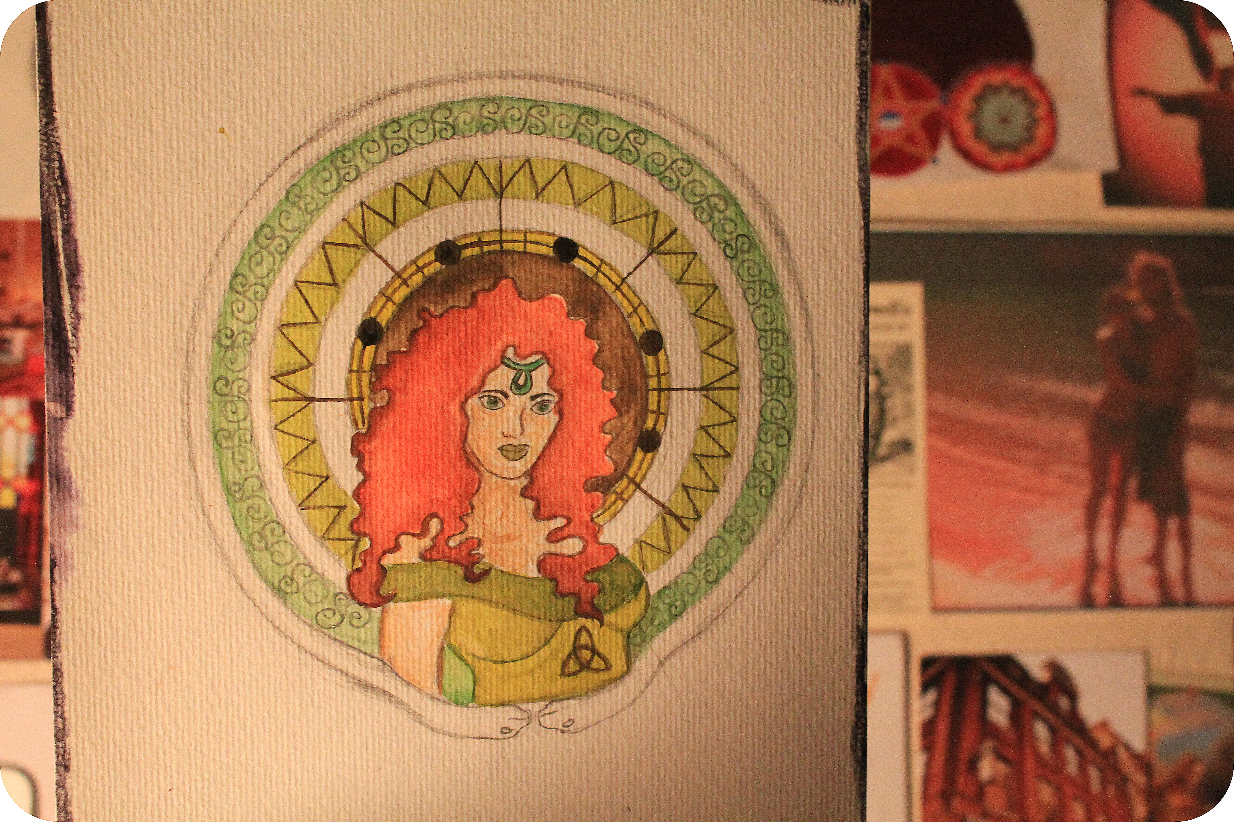
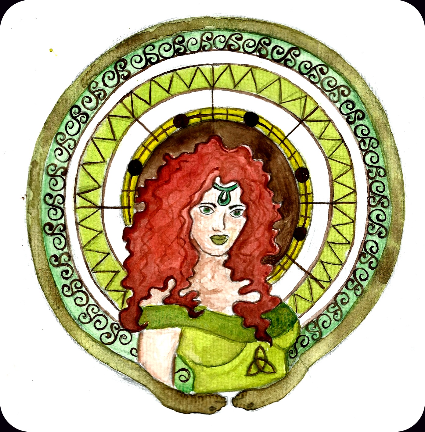
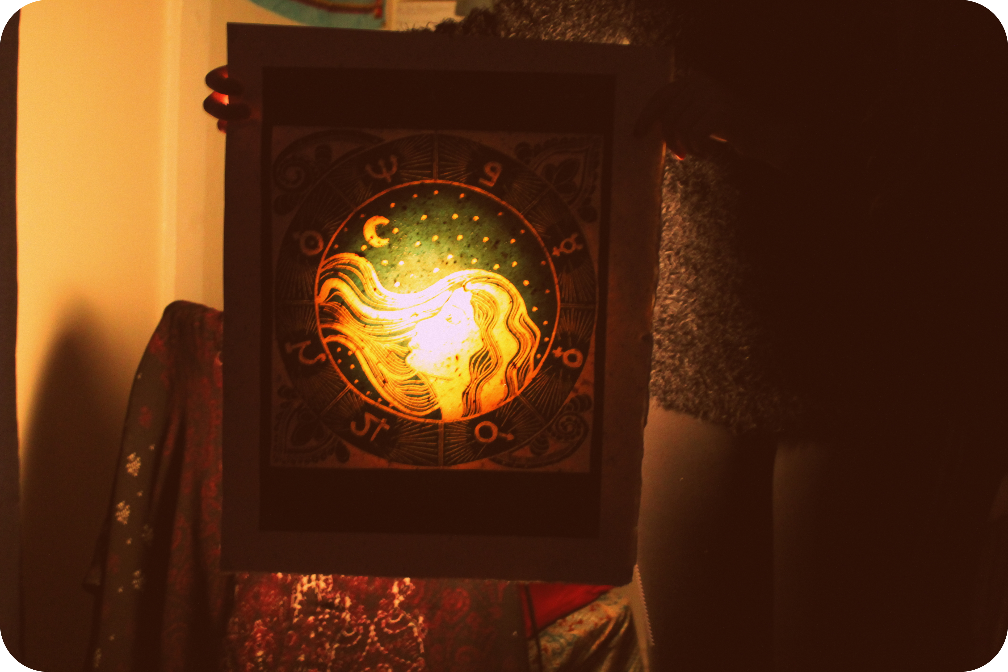
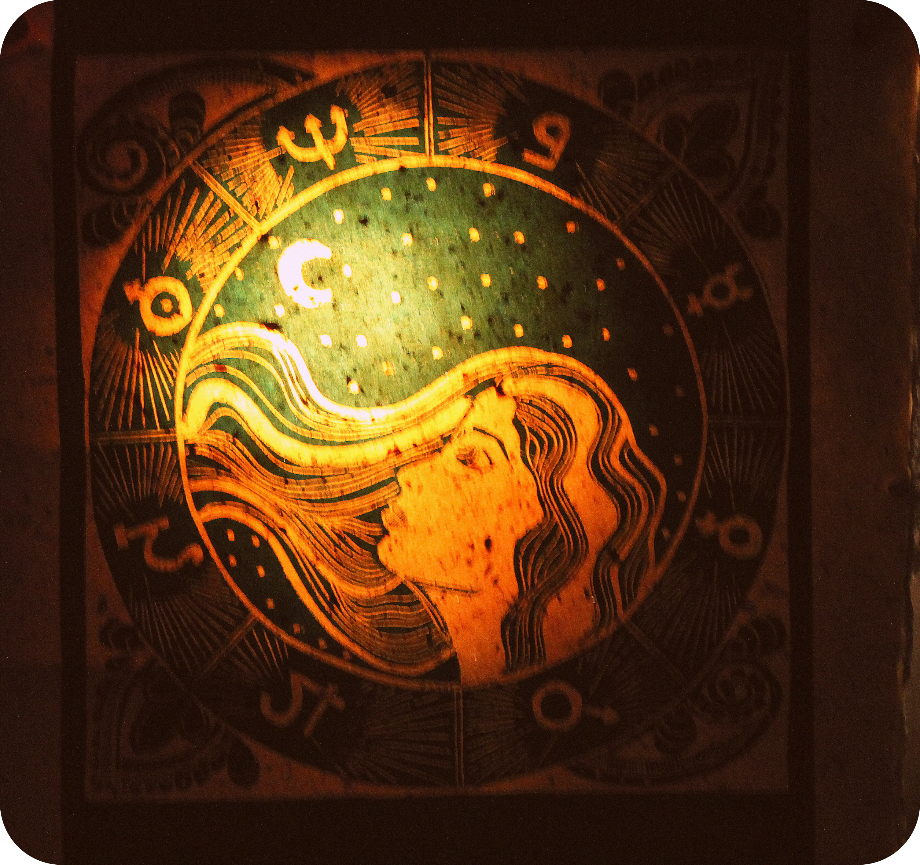
below are the images i will be using in my booklet scanned in and with spot colour added. Covering the folded paper booklet will be a stiff card jacket.

I will be letter pressing my details onto the laser cut a5 piece to give it a hand made feel and more of a personal touch.

Work In Progress

Today we had the work in progress group meeting with johnny Hannah to get some feedback on the work we have completed in the first few weeks of the Final major project. I explained my Goddess idea to johnny as he had not heard much about it and was pleased that i had already got stuck in with lino printing and testing out ideas and layouts.

Johnny commented on how i need to take my project down a more focussed route now and experimenting and getting stuck in with lino printing first was great but now i need to concentrate on my research and planning out what to do next.

Having gone full steam ahead with my project at the start i have now stepped back and decided to take my time and really figure out what it is i need to research and what 4 goddesses i want to focus all my energy on.

My To Do List

  • Research and decide what 4 Goddesses to pick to illustrate
  • Test out ideas with lino cut and maybe try 3 colour linocut
  • Keep on gathering research to aid final images
  • Start testing with the laser cut machine
  • Test prints with laser cut images


Self Promotion Launch

Today we had our self promotion launch this is a 2 week project to produce self promotional artwork to send out to art directors and magazines of our choice. We must produce a set of 10 postcards, small booklets and mini posters ect which will be sent to the potential clients.

These must be completed by March 10th at the latest.

On March 13th Art director Brian Grimwood is coming down to the studios to critique our self promotion efforts along with Johnny Hannah. This is an exciting opportunity but also quite a daunting one as i will be in Paris from March 2nd till the 6th of March so my time spent on this project is even more limited. Having this limitation will help me with the pressures of the day to day working of an illustrator who usually has lots of projects to juggle at once.

Below are images i have sourced from Pinterest of self promotion ideas i would possibly like to try out. Maybe a booklet and postcard and fold out poster? i shall think about this and my next blog post will feature my final ideas and how i am going to achieve creating them.


5594_lg

Picture 51c41a5a5eab8357e43a3fddcb8571281

Development Work

Reading through my book on Gods and Goddess’s i am trying to search out and find 4 goddess’s that are connected in some way and have lots of symbolism attached to them. I want them to be complex but also easily understandable to the viewer. I want these Goddess’s to represent strength and for each goddess to have a story behind them.  Below are two rough sketches i have done to depict goddess’s of Celtic Tradition. They are the image of Ceridwyn Goddess of nature and worshipped mother figure and Morrigan the Celtic Goddess of war and fighting. Again i have used the pen and ink process to get my ideas down quickly and organise negative and positive space.

Below is Morrigan

Scan 4Scan 3

Above is Ceridwyn

I chose these two to try out as when reading and researching about these two Celtic goddess’s it was apparent that they were strong women with power. Each goddess had specific symbols attached to them to make them easier to define between one another. Ceridwyn had the tiny sapling plant and the plant seed emblem to represent her affiliation with nature. Morrigan has the 4 axes’s to represent her fighting spirit.

After brainstorming an idea for each Goddess and drawing out a rough of a possible design it became apparent to me that to just concentrate on Celtic Goddesses wasn’t delving deep enough. Although each goddess in there own right had symbolism attached to them i have decided it is not enough symbolism to create 4 dynamic and powerful and thought provoking final pieces. These rough images though can help me with discovering composition and positive and negative space in my chosen goddesses.

i will be spending this week deciding and researching what Goddesses to focus my designs on.


Portfolio Seminar With Funky Photoshop Tests

This week we had a portfolio seminar with Jonny Hannah and our visiting lecturer Salvatore Rubino. The purpose of the project is to create a professional portfolio by the end of the academic year. This portfolio will be shown to Agencies and possibly Art directors and it must contain about 10 pieces of your best work.

We were then shown examples of how a portfolio should be laid out. it must be kept simple and  in an A3 case with contact details. Pacing, composition, diversity, and consistency are what makes a great portfolio stand out and this got me thinking about how i would transfer my work into a portfolio.

My work is usually in print and uses a lot of black and white so already i knew i had to inject some colour into my work. To make my portfolio consistent and looking professional i would need to put all my work through photoshop and tidy it up.

Below is one of my pen and ink drawings of a Mandala design that i have done in the past. This design is purely in black and white as shown below. To inject some colour into this piece i simply dropped a bright fill colour to this image to make it stand out. Also below are examples of the experimentation i did while playing around on photoshop and what can be achieved with a little digital tweak.

From this seminar and from my photoshop experiments it has got me thinking about how i can use this in my FMP project. I will be printing my test laser cut pieces in black ink and this allows me to then scan these in. Without ruining the original print i can then tweak around with adding colour and tweaking the composition of the image meaning I’ve got more choice as to how my final images will look. Using this process with allow me to experiment and change my images while not being tied down to one colour and one composition.

black and white origional
Scan

scan

scan
scan


Untitled-1

Celtic Goddess From Start To Finish

Here is my Celtic Goddess portrayal from start to finish from initial idea to completed colour artwork.

Scan 140470001

Initial A5 ink and pen drawing

IMG_0184

Rough outline sketch of Celtic Goddess

Scan 140460009-1

Scanned in finished Pencil sketch ready to colour

IMG_0194

Initial first colour session using watercolour paint and inks

Scan 140470003-2

Scanned in finished artwork

I dont usually work in watercolour but in this instance as it was the weekend and access to the studios to purchase lino or print was unavailable i decided to work from home and see what i could create with little materials. Using watercolour was quite a challenge for myself as i am more adept at using acrylic and oil paint. Looking for positives i feel the colours i chose for a Earthy feel was correct and the symbolism isn’t to obvious which is what i like in my artwork.

I do however feel that this piece lacks originality and that my Goddess has a cartoon like quality that i don’t like. I like my work finished and neat but even for me this artwork seems to overworked and not natural enough.

My next step is re working ideas and adding more symbolism and trying to create a more organic and original portrayal of Goddess’s.

Celtic Creativity

Putting my Moon Goddess work to one side i decided to read up on the books i purchased from my trip to London. The “Signs and Symbols” book and “An A to Z of Pagan Gods & Goddess’s” book i purchased from Treadwells was my first port of call. In my initial research plan i had stated i was to research all types of different folklore tales and Goddess’s from different cultures and backgrounds. I stated i would research into Celtic Folklore and the Goddess’s surrounding Celtic tradtions.

While looking through the”A to Z of Gods and Goddess’s” book for research i came across the celtic theme i was looking for as shown below.

Scan 140470009

Reading up on Aoibheall and how she was a strong Celtic Goddess i decided to jump straight into my mini A5 sketchpad and draw with pen and ink what came to my mind and how i envisioned her.

Scan 140470001I have added some quite obvious symbols such as the Shamrock and as she is the Deity of Earth i added leaves and the shining sunshine behind her.

I wanted to take this drawing further but not have the symbols so obvious. Doing a bit of further reading in my ‘Symbols and Signs” book i discovered some Celtic symbols i could use in my next piece as shown below.

triskele-symbol-spiral-five-thirds-turns

The Celtic Knot symbolising growth and Spiritulism

celtic-37953_640

Another Celtic Knot this time more simple and the largely more recognisable symbol. Again meaning Pagan spirit and strength and wisdom.

Another symbol that came up in my research was the Celtic Serpent.This symbolises rebirth and is usually as a protector to the God or Goddess.

sn-kw-hz

I wanted to include all these symbols in my work and the next stage of the development of portraying a Celtic Goddess.The next stage i will show the process from start to finish of how my idea grew and how it ended up in my next post.

Lights Camera Action

I made a quick video experimenting with the spotlight and seeing how depth affected the artwork. Moving the artwork from close to far away in the video shows how the lights bounces off different parts and how this looks. This is my first attempt at using video media to present my work and even thought this video is short i can see how taking a static lino print to a moving image works well and is a successful experiment.  I am pleased with the outcome of this and will be experimenting more with lights later on when my laser cut images are complete and i have printed my  final pieces.

Religious Research

On going from my last post i have researched some stained glass windows with images of Jesus and other such deities to give me a feel of how grand and epic these images are. I want my final Prints to have a biblical feel to them as they are on such a grand scale which is on par with the scale of stained glass windows. Stained glass windows have the light shining behind them enhancing the image and this is what i feel i would like my prints to look like. If i was to use lighting behind them then it is for the reason to enhance the final image not just for decoration.

1stainedglass-211x300 Bayeaux Window images(These images are sourced from Google)

Let There Be Light

To experiment further with the lino prints i did previously i have decided to experiment with light and how this affects the overall artwork. I was thinking of ways to experiment with my printed lino images and while browsing the web found this image below

visualpilots_Shadowlounge_Cornerlamp_700

PROJECTS

This is of card cut images, that i think are most likely to be laser cut and not by hand. The images are projected onto plain walls to create shadows and light. This inspired me to experiment with light with the lino cuts. I think within the final major project there is still room to experiment with new techniques and ideas and so this is what i have decided to do.

Below are images i have taken of the Moon Goddess lino print with a spotlight shining behind it to give it real moon shine upon it.

Image

 IMG_0173

 IMG_0176

IMG_0177

IMG_0179

IMG_0180

I think these worked really well as it makes the image look like the moon is actually shining. The paper the print is already on is quite thick and is a naturally made part with small paper chippings in it which gives it a lovely hand made look.

This process of taking a plain lino print and using it in a different way has inspired me to think about how i will present my Laser Cut Prints. I have the idea of hanging up my A2 prints from the ceiling using wire and shining lights behind them a bit like stained glass windows. Goddess’s are deities and are worshipped just as Jesus is in a church so to play on this idea would be quite interesting.

In my next blog post i will explore this idea further with images and research.